Boxplots, also known as box and whisker plots, are a useful tool for visualizing numerical data in statistics. They provide a graphical representation of the distribution of a dataset by highlighting its quartiles, median, and any potential outliers. In SPSS, creating side-by-side boxplots allows for the comparison of multiple groups or categories within a single plot, making it easier to identify differences and similarities between them. In this guide, we will walk through the step-by-step process of creating side-by-side boxplots in SPSS, from importing the data to customizing the plot to fit your needs. By the end, you will have a solid understanding of how to utilize this feature in SPSS to effectively analyze and present your data.
Creating side-by-side boxplots in SPSS is a useful way to visually compare two or more sets of data. To do this, start by selecting “Graphs” from the main menu and then choose “Legacy Dialogs.” From there, select “Boxplot” and then “Side-by-Side” from the options. Next, select the variables you want to compare and click “Define.” You can then customize your boxplots by selecting “Options” and making changes to the appearance, labels, and other settings. Once you are satisfied with the settings, click “OK” to generate the side-by-side boxplots. This will allow you to easily compare the distribution, central tendency, and variability of the different variables in your data set.
Create Side-by-Side Boxplots in SPSS
Side-by-side boxplots are a useful way to compare the distribution of data values in multiple groups at once.
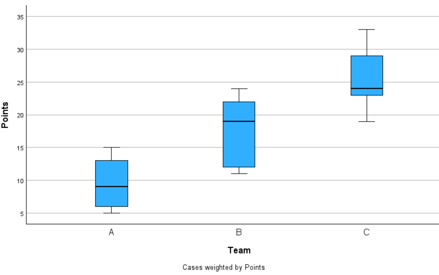
This tutorial explains how to create the following side-by-side boxplots in SPSS:

Let’s jump in!
Example: How to Create Side-by-Side Boxplots in SPSS
Suppose we have the following dataset in SPSS that contains information about points scored by basketball players on three different teams:

Suppose that we would like to create side-by-side boxplots to visualize the distribution of points scored by players on each team.
To do so, click the Graphs tab, then click Boxplot:

In the new window that appears, click the Simple icon, then click Define:

In the new window that appears, drag Points to the Variable panel, then drag Team to the Category Axis panel:

Once you click OK, the following side-by-side boxplots will be created:

The x-axis displays each unique team name and the y-axis displays the points for each team.
From viewing the boxplots we can see that team C has the highest median points per player while team A has the lowest median points per player.
We can also see that team B has the largest interquartile range, which represents the difference between the 75th percentile and 25th percentile of points scored.
Additional Resources
The following tutorials explain how to perform other common tasks in SPSS:
@media(max-width:1200px){}.novashare-inline:not(.novashare-columns) .novashare-buttons-wrapper{justify-content:center;}body .novashare-inline:not(.novashare-columns) a.novashare-button, body .novashare-inline .novashare-total-share-count{margin:0px 5px 10px 5px;}body .novashare-buttons.novashare-inline .novashare-button-icon{width:100%;}
Side-by-side boxplots are a useful way to compare the distribution of data values in multiple groups at once.
This tutorial explains how to create the following side-by-side boxplots in SPSS:

Let’s jump in!
Example: How to Create Side-by-Side Boxplots in SPSS
Suppose we have the following dataset in SPSS that contains information about points scored by basketball players on three different teams:

Suppose that we would like to create side-by-side boxplots to visualize the distribution of points scored by players on each team.
To do so, click the Graphs tab, then click Boxplot:

In the new window that appears, click the Simple icon, then click Define:

In the new window that appears, drag Points to the Variable panel, then drag Team to the Category Axis panel:

Once you click OK, the following side-by-side boxplots will be created:

The x-axis displays each unique team name and the y-axis displays the points for each team.
From viewing the boxplots we can see that team C has the highest median points per player while team A has the lowest median points per player.
We can also see that team B has the largest interquartile range, which represents the difference between the 75th percentile and 25th percentile of points scored.
Additional Resources
The following tutorials explain how to perform other common tasks in SPSS: